Last weekend I played Sequence with my friends Jeff and Crystal. It’s a neat game that combines several standard game mechanics (deck of cards, board, tokens) to make for a rockin’ good time that can also turn super ugly and make your best friends into your worst enemies.
(Jeff, Crystal- if you’re reading this, I will get you back.
Also you’re my buddies and you deserve the best.
BUT NEXT TIME YOU LEAVE MY TOKENS WHERE THEY ARE! 😡)
So as I was saying…
I couldn’t help but analyze the brand position of the game because…
Well, because I’m a nerd.
But my nerdiness is your gain, because I notice little elements of positioning strategy in everyday life and can pass those little nuggets on to you.
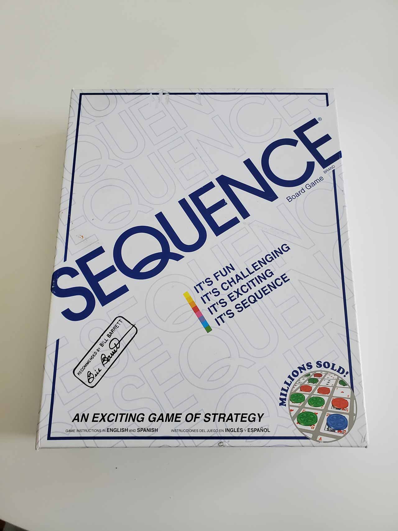
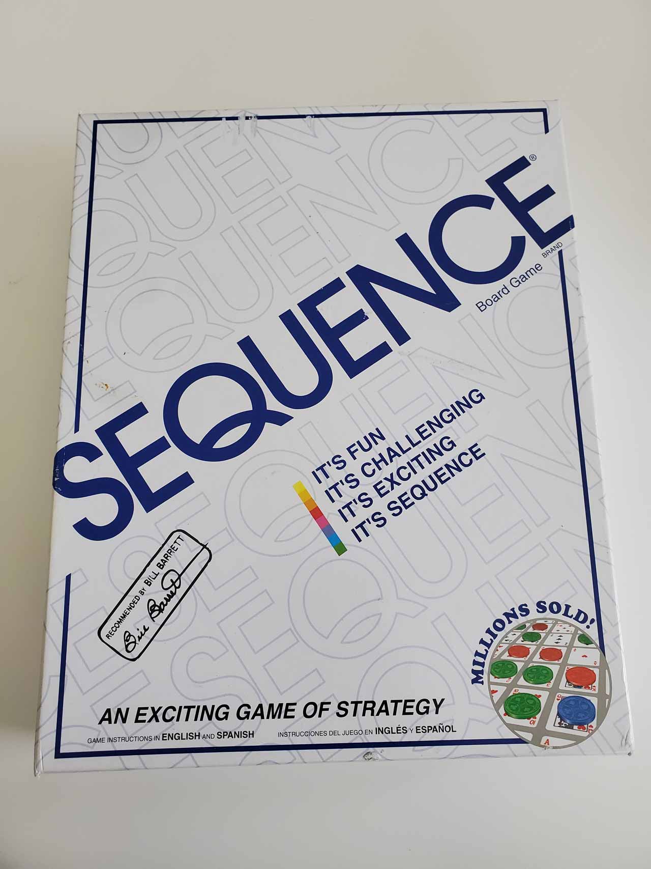
The Sequence board game box is a great brand positioning case study.
Here’s what I saw:
The cover of the Sequence box communicates four key elements of the brand that our company always creates with our clients before they just start pushing out content left and right:
You can also see two credibility builders on the front:
Not gonna lie: I don’t know why Bill Barrett’s recommendation matters.
I don’t know him.
That may not even be part of the original box.
Maybe some guy named Bill Barrett just stamped the silly thing.
(UPDATE: My apologies to Bill Barrett. Apparently he helped Jax Games get off the ground, and the stamp is a sign of appreciation. Way to go Bill!)
But so far the brand is still solid. You know what you’re getting, and if you’re a dude like me, it sounds fun.
The side of the box top is less impressive.
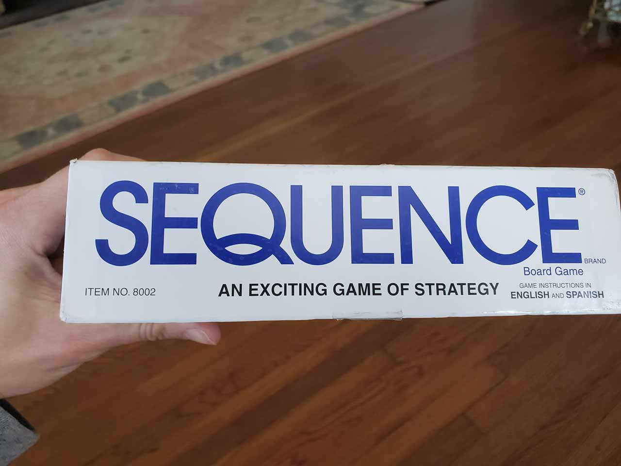
The designers did make the good decision of repeating the name and tagline so you can see them even when the game is on the shelf.
Then they wrote that the game instructions are in English and Spanish…
But only write that in English.
🤔
Seems like a missed opportunity to speak to a Spanish-speaking audience.
When you rotate the top of the box, you can see the name again, along with the recommended age range for game play and number of players.
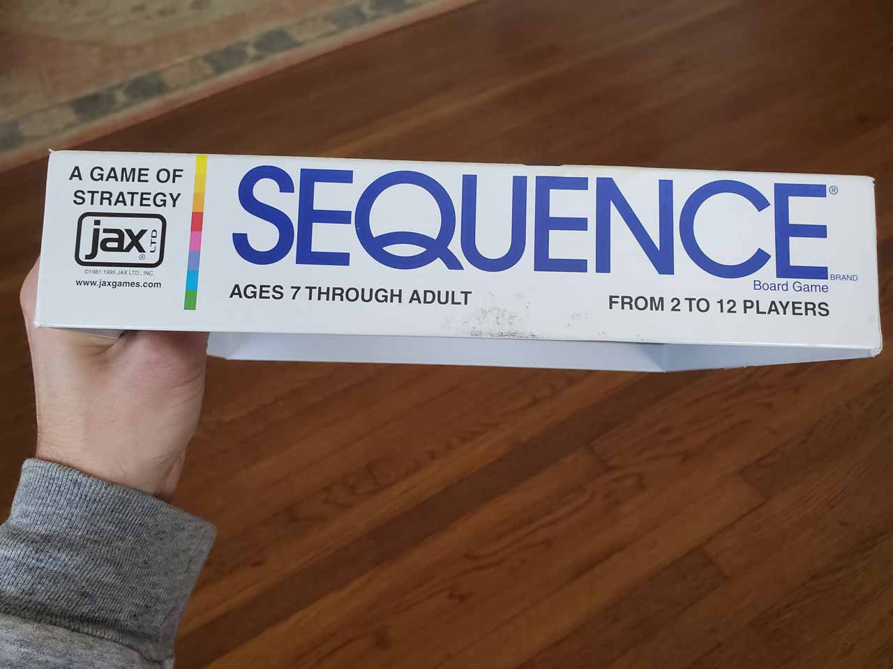
OK, not bad information.
You can also see the parent brand company name, which is smart. Sequence is a divergent brand of the larger game company, Jax Games. If you like Sequence, you might like some of the other games.
Maybe they should cross-sell them, right?
Well guess what, gaming buckaroo?
They do!
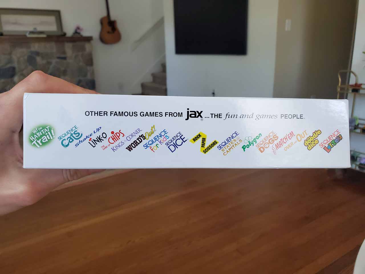
On the side of the box bottom, you can see all of the other Jax Games, along with the Jax Games website and tagline:
The Fun and Games People.
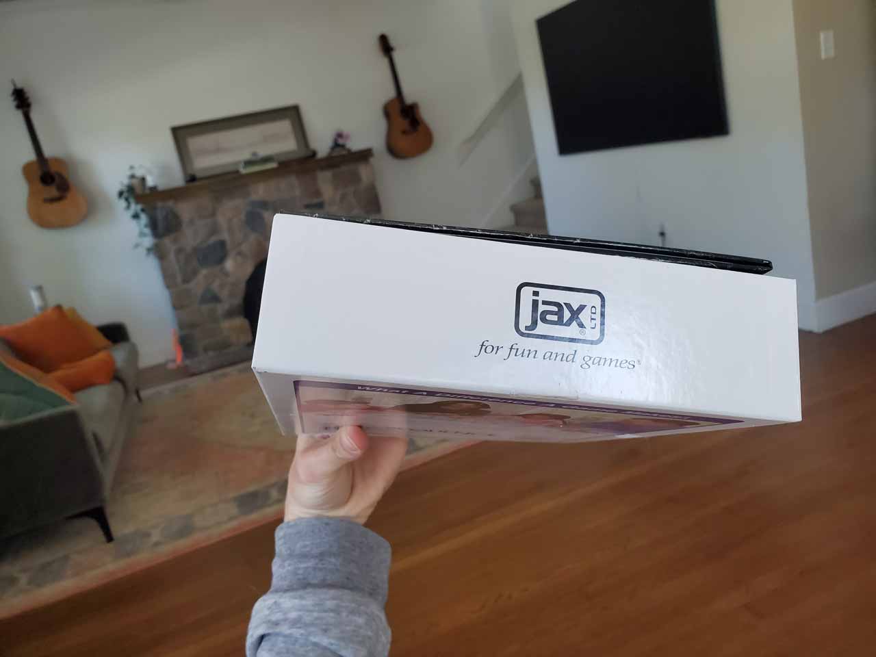
And when you rotate the box bottom, you see the parent brand again with an alternative tagline:
For Fun and Games.
So on a single box, they have managed to show you:
Not too shabby for an old cardboard box.
Of course, they didn’t just think all of that stuff up when they were coming up with the box.
The marketers took their time to determine the right message for Sequence, and for the Jax Company, long before the game was ever brought to market.
The lesson:
When you build out your own brand, take the time to figure out your positioning before you ever launch.
Let the Sequence box be your muse.
TL;DR: The Sequence board game box is a great brand positioning case study because it manages to communicate many of the key elements of the brand in a quick and easy way, building credibility and loyalty from players before and after game play.
For more positioning insights, subscribe to our newsletter, The RedShift Effect.
Need to position your brand? Book an appointment.